| The LookOut columns |

|
What I Say | About
Frank Gruber Email Frank |
||||||
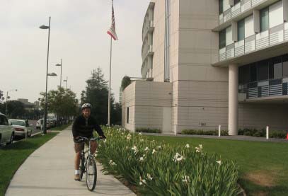
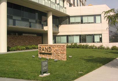
| What's Wrong with These Pictures? By Frank Gruber I am still thinking about the Civic Center. Now that the City Council has updated the Civic Center plan, the City will soon start evaluating proposals to build the housing component of the plan -- the "Village." Although the plan is a good one, it's important to evaluate what's gone wrong with what has so far been built under it; namely, the Public Safety Building and RAND's new headquarters. Let me say at the outset that I don't believe either building is a failure architecturally; both, in fact, are handsome if not landmarks. But they don't satisfy the plan's standards for "placemaking." Pictures can be worth thousands of words, and to save you from having to read too many of mine, last week I took my camera and wandered around. Here's a picture of RAND's front yard and the sidewalk in front.
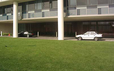
While you're looking that picture over, and the next one, consider that one explicit policy of the plan is that buildings are "to provide spatial definition to public spaces including parks, promenades, and streetscapes."
Another policy is that buildings should "introduce activities and treatments at the ground level of buildings to contribute to a visually interesting and public-spirited pedestrian environment."
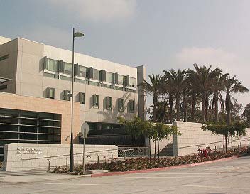
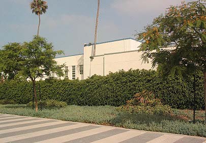
It's not just RAND that decided not to define public space. Here's a photo of the front of the Public Safety Building.
Note the big blank walls between the building, its fountain and little plazas, and the sidewalk. What are they doing there? Whatever happened to big, welcoming doors on public buildings? There are reasons the Civic Center is such dead space now. The Civic Center in all its 1950s glory is neither fish nor fowl: it's not a park, but, notwithstanding its urban functions, it's not urban either. Here's a shot of the north side of the Courthouse, facing Olympic Drive, with landscaping added when Olympic Drive was constructed.
What is this, a building, or a wood? There's not even a bench; so much for "public-spirited pedestrian environment." It's the Arcadian impulse run amok. Our Jeffersonian distrust of the city is so ingrained, that we would rather build silly faux forests than design streets on which people might actually want to walk, or plazas at which they might actually congregate, or buildings that welcome human beings (who aren't arriving by car). We think we're being "environmental," but our landscaped hybrid has no connection to nature, either. I like to hike in the mountains. I like to walk along the beach and Palisades Park. I can be as Arcadian as the next person. I love street trees. But you don't make a constructed place a natural place by imitating nature; you create places that don't work for either purpose.
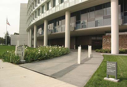
Note that the little sign says no trespassing. Right now hopes for defining public space in the Civic Center lie with the parking structure going up on Fourth Street (let's hope there will be someplace on the ground floor where a body will be able to get something to eat), the Village housing, the future city services building (now much diminished in size), the new parks, and the redevelopment of the streets, including the extension of Olympic Drive, the rerouting of Main Street in front of City Hall, and the building of the fountain and traffic circle at the Main Street bend. There are still a lot of opportunities, but I'm not hopeful. The plan is one thing, but, oh, the details. * * * I'll try to be constructive for the rest of the column. I have two suggestions. We need to get people into the Civic Center or the new one will be just as dull as the old one. The 1993 plan had a cool idea for a tall "Viewing Tower" on the plaza in front of City Hall. It was planned to be part of the city services building. The tower seems to be missing from the current iteration of the plan, but I don't recall when it was dropped. The plans for the city services building have been drastically reduced in size, to accommodate a new route for Main Street to take to the planned Second Street Bridge. My suggestion is to build the tower as a stand-alone structure, a real architectural statement, like that famous tower in Pisa or the Campanile in Venice. People could hike up or take an elevator, and at the top they'd have fantastic views. The kind of views that usually go with high rents, but these would be democratic. We need the tower because it would have no functions other than (a) being beautiful and fun and (b) expressing pride in our city. By doing those things, it would incidentally enliven the whole area. The other suggestion I have is more technical. The Council voted to limit the height of housing in the Civic Center to 56 feet; staff had recommended an 84-foot limit on the site adjacent to the Viceroy. The council (most of it) also wants to achieve 325 housing units, however, and indicated that it would be open to revisiting the height issue if a developer made a good proposal. I'm not a fan of buildings taller than six stories myself. I like the look and density of cities built before elevators. But I suggest that a better height limit would be 65 feet. What the Council learned last year in the context of revising downtown building standards was that by allowing architects to design six-story buildings up to 65 feet, you encourage the use of steel construction. Steel construction is more expensive, but it gives architects more flexibility. In particular, it allows for high ceilings on ground floors -- good both for retail and for the live/work and artist housing the Council wants -- and for more courtyards and other open -- and usable -- space. * * * Without much attention being paid to it, the Planning Commission has been inviting speakers to come talk at Commission meetings about issues that inform the current updates to the land use and circulation elements of the general plan. At last week's meeting the Commission invited an economist, Susanne Trimbeth, and an urban designer, Robert Harris (recently retired from USC), and both of them gave terrific presentations. Among many other things, Dr. Trimbeth talked about the importance for planning to reflect economic and social realities, and Prof. Harris talked about the need to create urban places that are "tempting" and "agreeable." For anyone who is interested in the issues that come up over and over in this column, I recommend spending an hour and a half watching the presentations. They're available on the City's new web-casting feature. Go to the Planning Commission Web site. Click on the meeting of July 6. The Trimbeth and Harris presentations start at the one hour, sixteen minute mark (1:16), and you can move the cursor to that point. | ||||||||
| |
The
views expressed in this column are those of Frank Gruber and do not necessarily reflect the opinions of The Lookout. |
Copyright 1999-2008 surfsantamonica.com. All Rights Reserved. |
